pacman::p_load(tidyverse)Hands-on Exercise 1
This file follows Chapter 1 of R for Visual Analytics. I kept the chapter order, then explained each code line in plain English so the logic stays easy to follow.
The exam file is read from ../data/wk1/Exam_data.csv because this exercise file lives inside the HO_Ex folder.
1.1 Learning Outcome
This chapter shows the basic building blocks of ggplot2 and how to combine them step by step.
1.2 Getting started
1.2.1 Installing and loading the required libraries
Layman explanation: Line 1: pacman::p_load(tidyverse) — Loads the tidyverse package family in one step so R is ready for data work and plotting.
1.2.2 Importing data
The exam file contains student scores plus basic categories such as class, gender, and race.
exam_data <- read_csv("../data/wk1/Exam_data.csv")Layman explanation: Line 1: exam_data <- read_csv("../data/wk1/Exam_data.csv") — Reads the CSV file into a table called exam_data so we can use it later.
1.3 Introducing ggplot
1.3.1 R Graphics VS ggplot
Base R gives a quick one-shot chart, while ggplot2 builds the chart in layers and gives more control.
hist(exam_data$MATHS)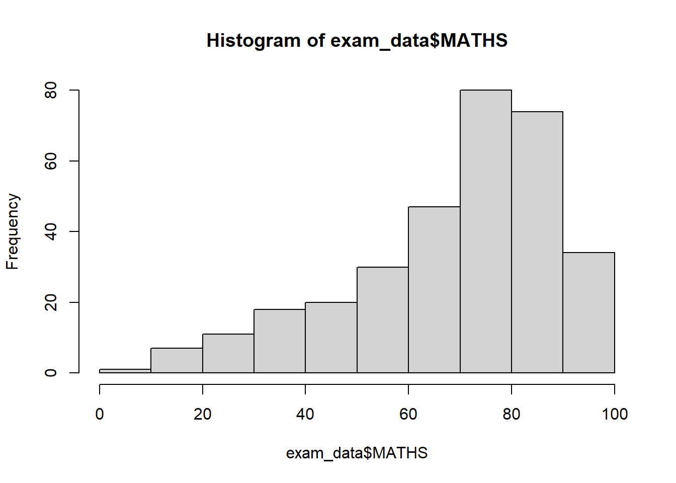
Layman explanation: Line 1: hist(exam_data$MATHS) — Uses base R to draw a quick histogram of the Maths scores.
ggplot(data=exam_data, aes(x = MATHS)) +
  geom_histogram(bins=10,
                 boundary = 100,
                 color="black",
                 fill="grey") +
  ggtitle("Distribution of Maths scores")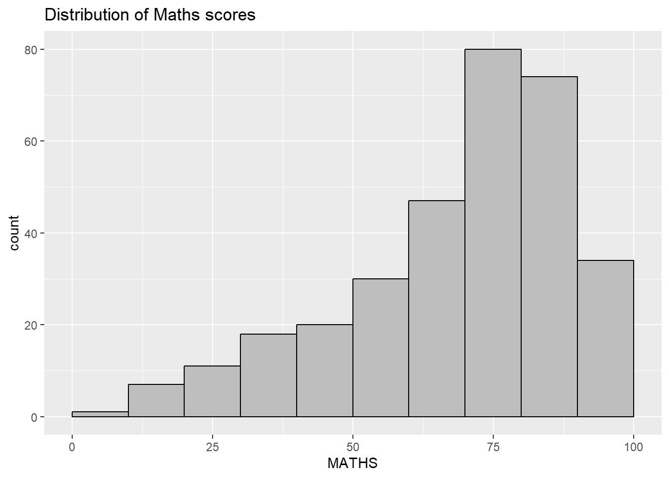
Layman explanation: Line 1: ggplot(data=exam_data, aes(x = MATHS)) + — Starts a ggplot using the exam data and maps MATHS to the x-axis. The plus sign means another layer follows. Line 2: geom_histogram(bins=10, — This splits the Maths scores into 10 bins so the histogram has 10 groups. Line 3: boundary = 100, — This sets the bin boundary around 100 so the histogram starts at a sensible edge. Line 4: color="black", — This gives the bars a black outline. Line 5: fill="grey") + — This fills the bars with grey. The plus sign means another layer follows. Line 6: ggtitle("Distribution of Maths scores") — Adds a title to the plot.
1.4 Grammar of Graphics
Think of a plot as data plus visual mappings plus shapes, with extra layers for summaries, panels, axes, and styling.
1.4.1 A Layered Grammar of Graphics
ggplot2 follows the layered grammar idea: build the chart piece by piece instead of trying to draw everything in one command.
1.5 Essential Grammatical Elements in ggplot2: data
A ggplot object starts with the data table, even before any shape is drawn.
ggplot(data=exam_data)
Layman explanation: Line 1: ggplot(data=exam_data) — Starts a ggplot using the exam data as a blank plotting canvas.
1.6 Essential Grammatical Elements in ggplot2: Aesthetic mappings
Aesthetic mapping tells ggplot which data values should control position, colour, fill, size, and other visual features.
ggplot(data=exam_data,
       aes(x= MATHS))
Layman explanation: Line 1: ggplot(data=exam_data, — Starts a ggplot using the exam data; the next line will define the visual mapping. Line 2: aes(x= MATHS)) — Maps MATHS to the x-axis.
1.7 Essential Grammatical Elements in ggplot2: geom
Geoms are the visible marks, such as bars, dots, lines, and boxes.
1.7.1 Geometric Objects: geom_bar
ggplot(data=exam_data,
       aes(x=RACE)) +
  geom_bar()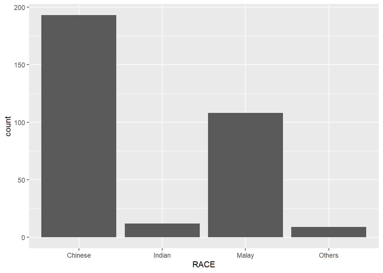
Layman explanation: Line 1: ggplot(data=exam_data, — Starts a ggplot using the exam data; the next line will define the visual mapping. Line 2: aes(x=RACE)) + — Maps RACE to the x-axis. The plus sign means another layer follows. Line 3: geom_bar() — Counts how many students are in each category and draws one bar per category.
1.7.2 Geometric Objects: geom_dotplot
ggplot(data=exam_data,
       aes(x = MATHS)) +
  geom_dotplot(dotsize = 0.5)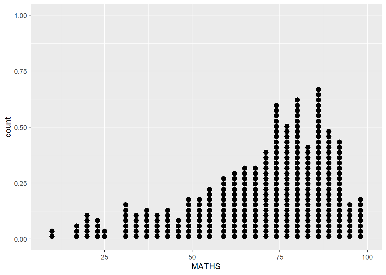
Layman explanation: Line 1: ggplot(data=exam_data, — Starts a ggplot using the exam data; the next line will define the visual mapping. Line 2: aes(x = MATHS)) + — Maps MATHS to the x-axis. The plus sign means another layer follows. Line 3: geom_dotplot(dotsize = 0.5) — This keeps the points small.
ggplot(data=exam_data,
       aes(x = MATHS)) +
  geom_dotplot(binwidth=2.5,
               dotsize = 0.5) +
  scale_y_continuous(NULL,
                     breaks = NULL)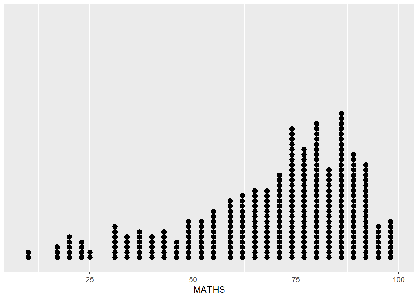
Layman explanation: Line 1: ggplot(data=exam_data, — Starts a ggplot using the exam data; the next line will define the visual mapping. Line 2: aes(x = MATHS)) + — Maps MATHS to the x-axis. The plus sign means another layer follows. Line 3: geom_dotplot(binwidth=2.5, — This groups the dots in 2.5-point chunks so values that are close together stay together. Line 4: dotsize = 0.5) + — This keeps the points small. The plus sign means another layer follows. Line 5: scale_y_continuous(NULL, — This hides the y-axis title and tick marks so the dotplot looks cleaner. Line 6: breaks = NULL) — This removes the y-axis tick marks so the dotplot looks cleaner.
1.7.3 Geometric Objects: geom_histogram()
ggplot(data=exam_data,
       aes(x = MATHS)) +
  geom_histogram()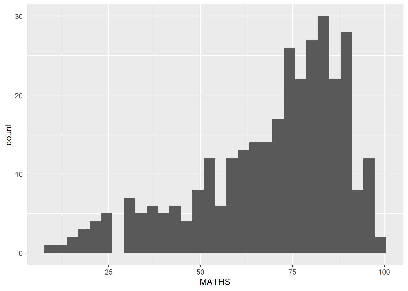
Layman explanation: Line 1: ggplot(data=exam_data, — Starts a ggplot using the exam data; the next line will define the visual mapping. Line 2: aes(x = MATHS)) + — Maps MATHS to the x-axis. The plus sign means another layer follows. Line 3: geom_histogram() — Draws a histogram using ggplot2’s default bin settings.
1.7.4 Modifying a geometric object by changing geom()
ggplot(data=exam_data,
       aes(x= MATHS)) +
  geom_histogram(bins=20,
                 color="black",
                 fill="light blue")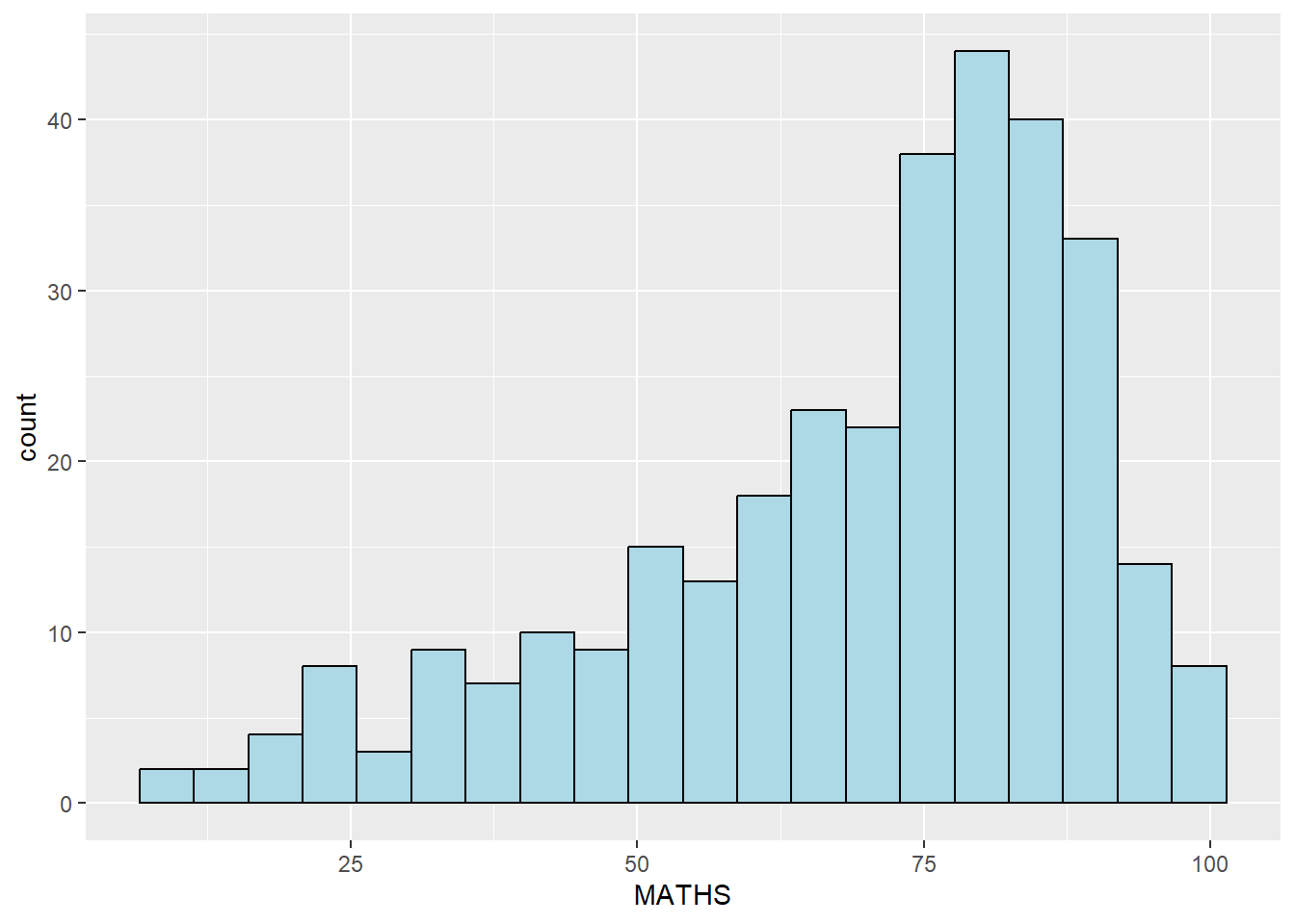
Layman explanation: Line 1: ggplot(data=exam_data, — Starts a ggplot using the exam data; the next line will define the visual mapping. Line 2: aes(x= MATHS)) + — Maps MATHS to the x-axis. The plus sign means another layer follows. Line 3: geom_histogram(bins=20, — This splits the values into 20 bins so the histogram becomes more detailed. Line 4: color="black", — This gives the bars a black outline. Line 5: fill="light blue") — This fills the bars with light blue.
1.7.5 Modifying a geometric object by changing aes()
ggplot(data=exam_data,
       aes(x= MATHS,
           fill = GENDER)) +
  geom_histogram(bins=20,
                 color="grey30")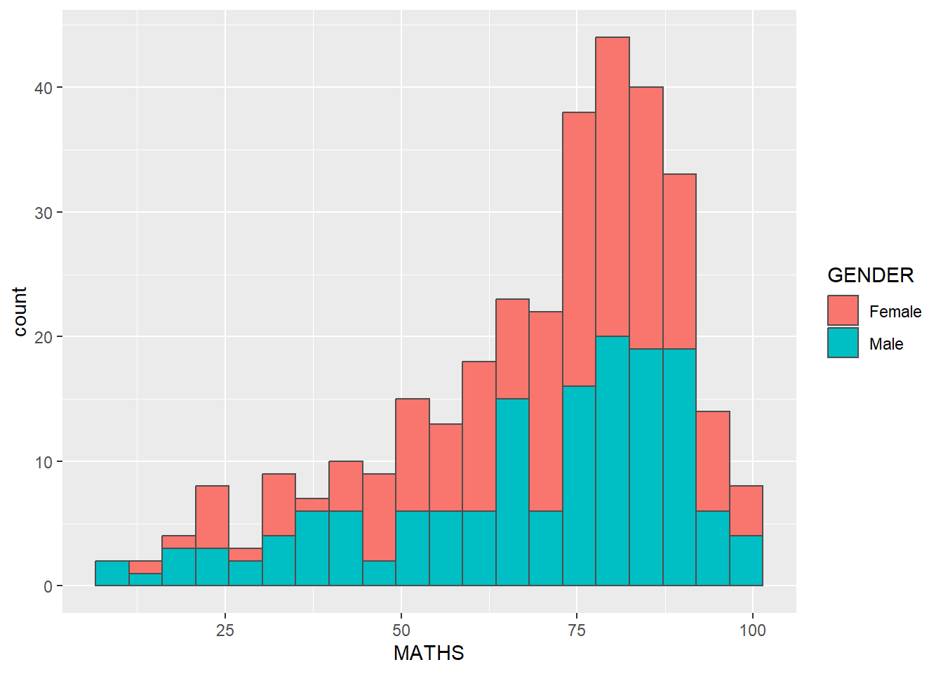
Layman explanation: Line 1: ggplot(data=exam_data, — Starts a ggplot using the exam data; the next line will define the visual mapping. Line 2: aes(x= MATHS, — Maps MATHS to the x-axis. Line 3: fill = GENDER)) + — Uses Gender to fill the histogram bars so the groups are easier to compare. The plus sign means another layer follows. Line 4: geom_histogram(bins=20, — This splits the values into 20 bins so the histogram becomes more detailed. Line 5: color="grey30") — This gives the bars a grey outline.
1.7.6 Geometric Objects: geom-density()
ggplot(data=exam_data,
       aes(x = MATHS)) +
  geom_density()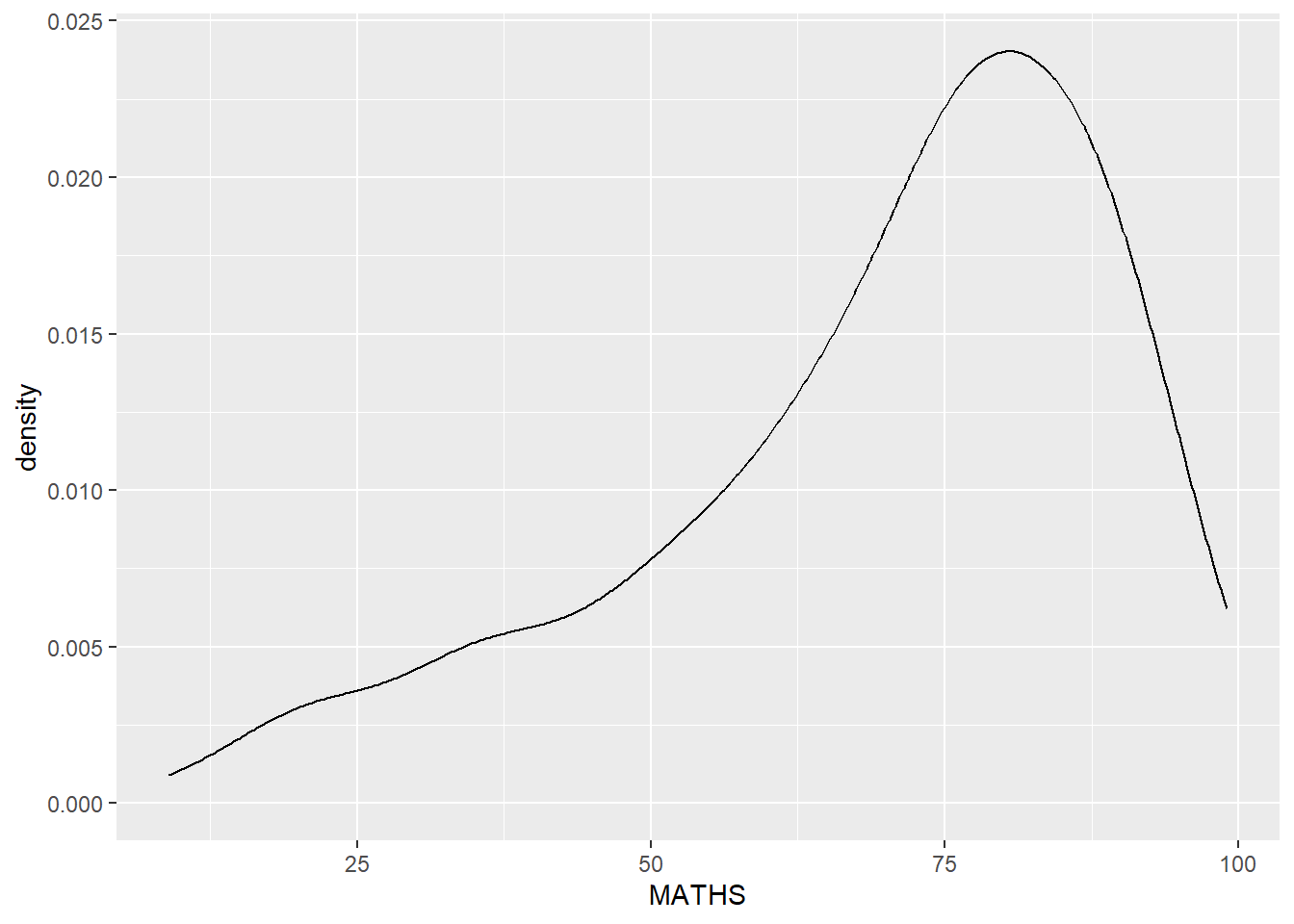
Layman explanation: Line 1: ggplot(data=exam_data, — Starts a ggplot using the exam data; the next line will define the visual mapping. Line 2: aes(x = MATHS)) + — Maps MATHS to the x-axis. The plus sign means another layer follows. Line 3: geom_density() — Draws a smooth density curve instead of bars to show where the values are concentrated.
ggplot(data=exam_data,
       aes(x = MATHS,
           colour = GENDER)) +
  geom_density()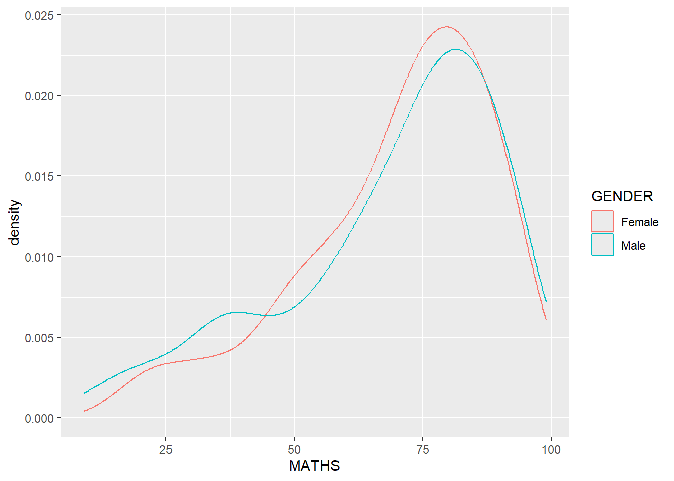
Layman explanation: Line 1: ggplot(data=exam_data, — Starts a ggplot using the exam data; the next line will define the visual mapping. Line 2: aes(x = MATHS, — Maps MATHS to the x-axis. Line 3: colour = GENDER)) + — Uses Gender to colour the curves so the groups are easy to tell apart. The plus sign means another layer follows. Line 4: geom_density() — Draws a smooth density curve instead of bars to show where the values are concentrated.
1.7.7 Geometric Objects: geom_boxplot
ggplot(data=exam_data,
       aes(y = MATHS,
           x= GENDER)) +
  geom_boxplot()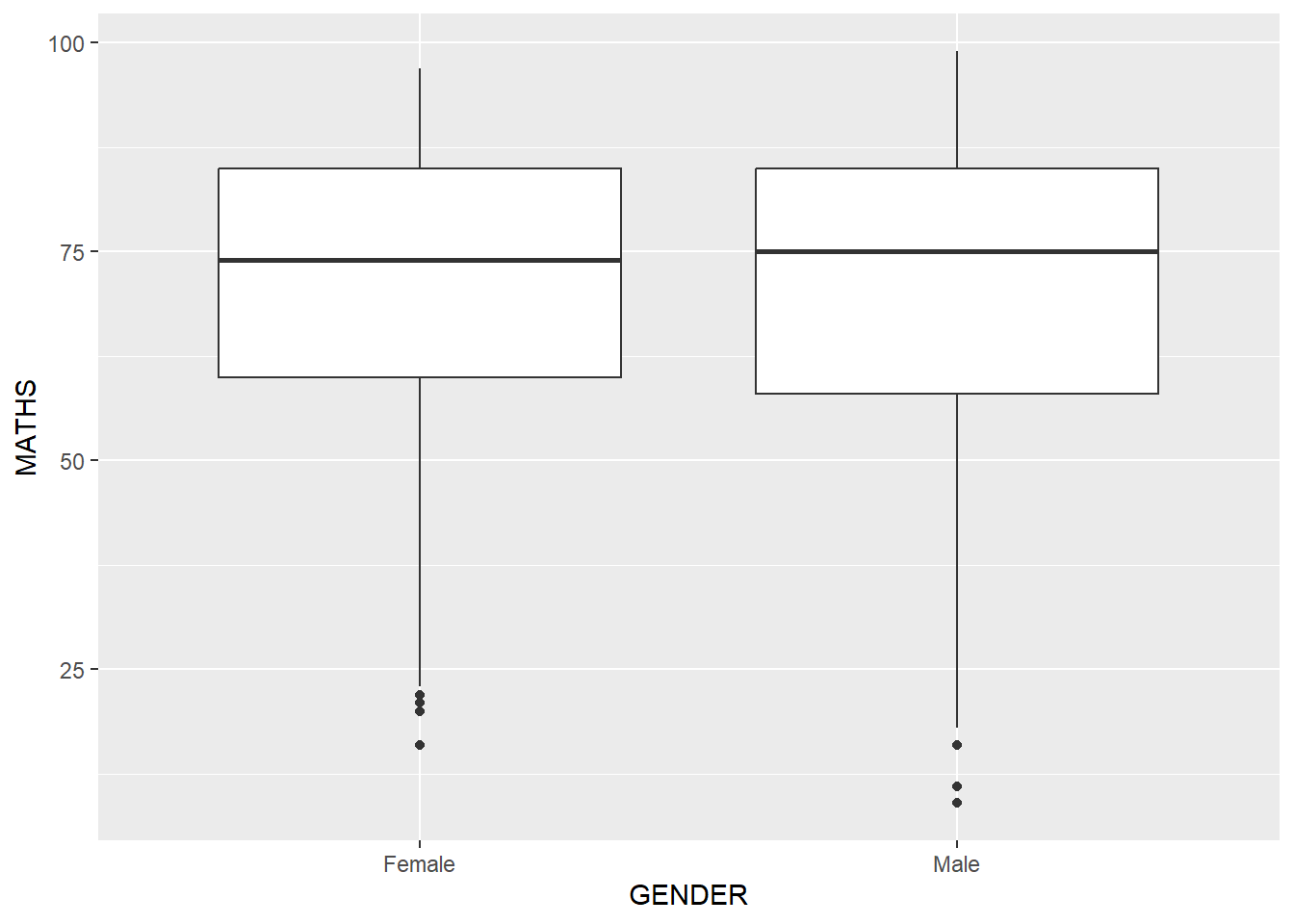
Layman explanation: Line 1: ggplot(data=exam_data, — Starts a ggplot using the exam data; the next line will define the visual mapping. Line 2: aes(y = MATHS, — Maps MATHS to the y-axis. Line 3: x= GENDER)) + — Maps GENDER to the x-axis. The plus sign means another layer follows. Line 4: geom_boxplot() — Summarises each group with a boxplot that shows the median, spread, and possible outliers.
ggplot(data=exam_data,
       aes(y = MATHS,
           x= GENDER)) +
  geom_boxplot(notch=TRUE)
Layman explanation: Line 1: ggplot(data=exam_data, — Starts a ggplot using the exam data; the next line will define the visual mapping. Line 2: aes(y = MATHS, — Maps MATHS to the y-axis. Line 3: x= GENDER)) + — Maps GENDER to the x-axis. The plus sign means another layer follows. Line 4: geom_boxplot(notch=TRUE) — Adds notches to the boxplot so we can compare the medians more easily.
1.7.8 Geometric Objects: geom_violin
ggplot(data=exam_data,
       aes(y = MATHS,
           x= GENDER)) +
  geom_violin()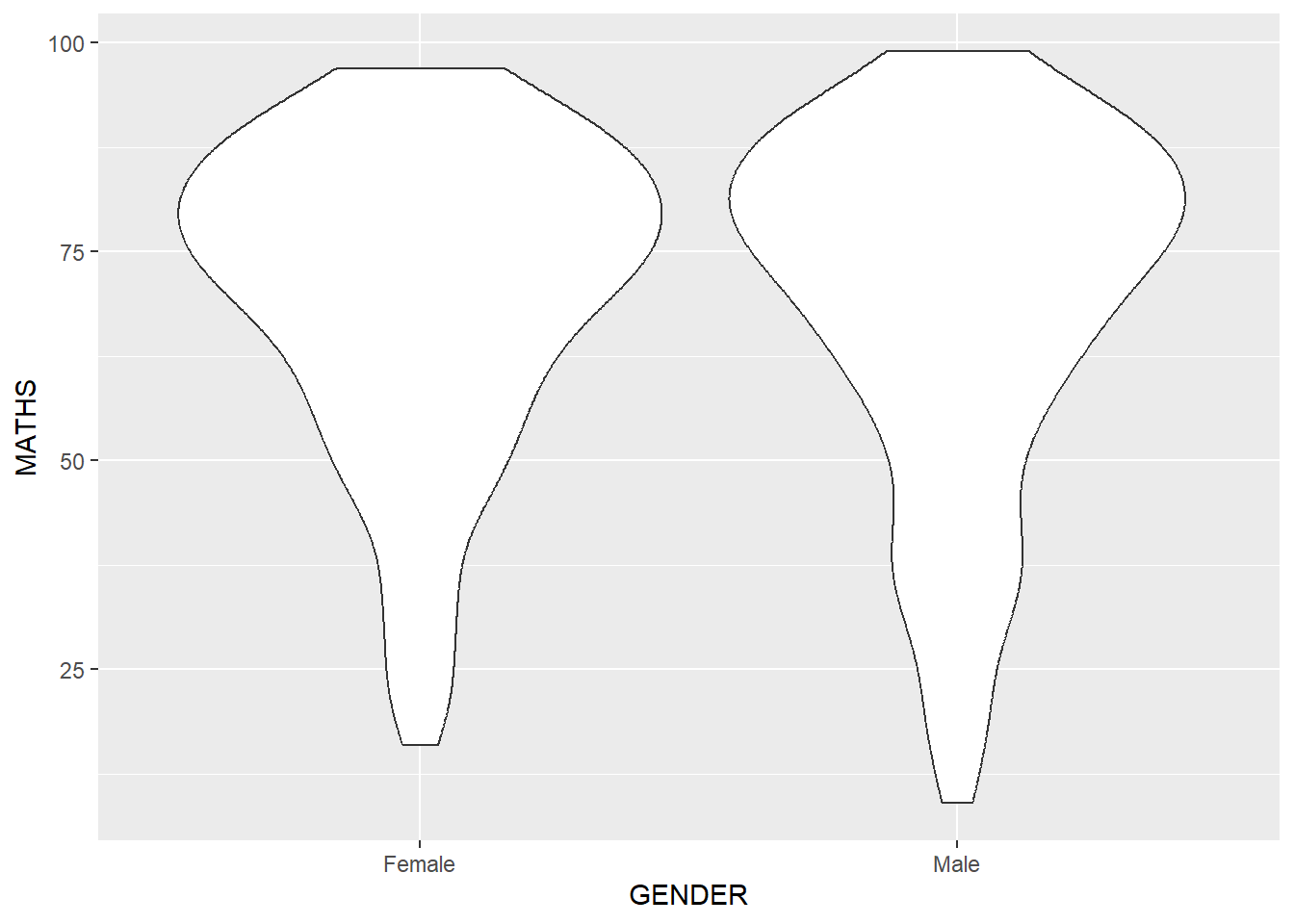
Layman explanation: Line 1: ggplot(data=exam_data, — Starts a ggplot using the exam data; the next line will define the visual mapping. Line 2: aes(y = MATHS, — Maps MATHS to the y-axis. Line 3: x= GENDER)) + — Maps GENDER to the x-axis. The plus sign means another layer follows. Line 4: geom_violin() — Draws a violin plot, which shows the distribution shape in a wider-or-narrower form.
1.7.9 Geometric Objects: geom_point()
ggplot(data=exam_data,
       aes(x= MATHS,
           y=ENGLISH)) +
  geom_point()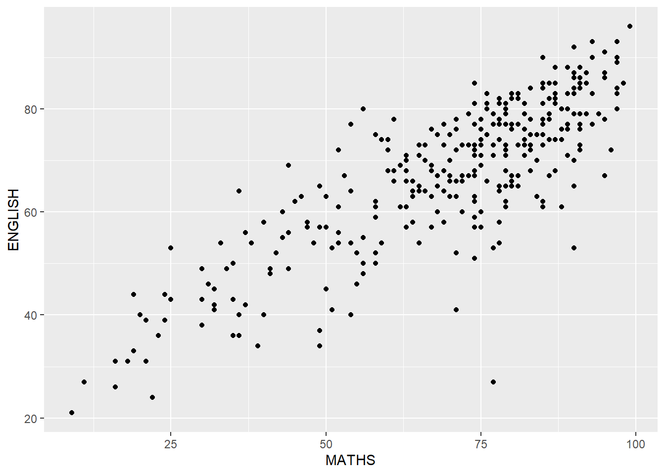
Layman explanation: Line 1: ggplot(data=exam_data, — Starts a ggplot using the exam data; the next line will define the visual mapping. Line 2: aes(x= MATHS, — Maps MATHS to the x-axis. Line 3: y=ENGLISH)) + — Maps ENGLISH to the y-axis. The plus sign means another layer follows. Line 4: geom_point() — Draws each student as a point so we can see the relationship between two numeric variables.
1.7.10 geom objects can be combined
ggplot(data=exam_data,
       aes(y = MATHS,
           x= GENDER)) +
  geom_boxplot() +
  geom_point(position="jitter",
             size = 0.5)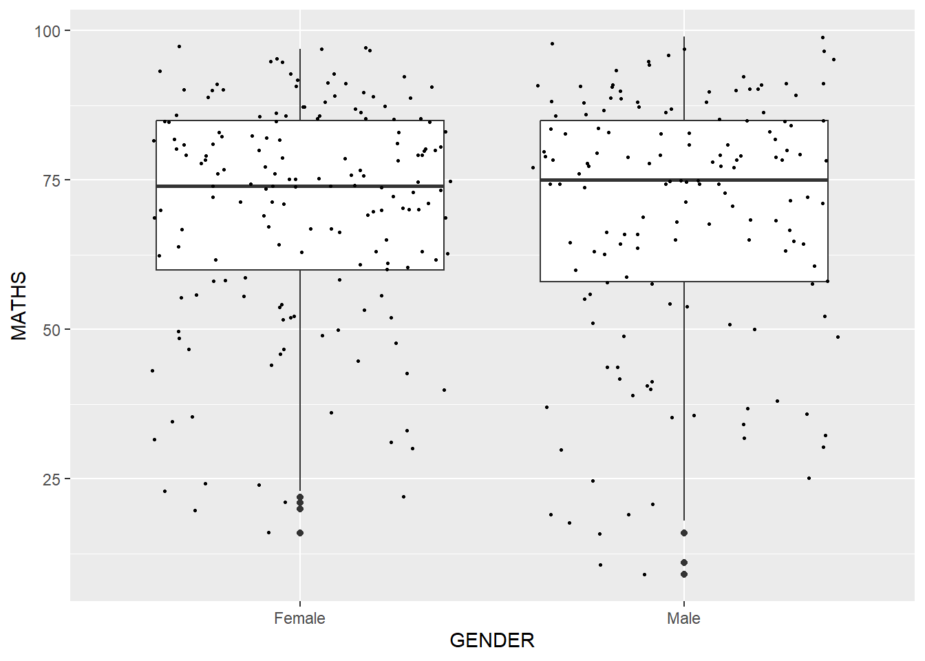
Layman explanation: Line 1: ggplot(data=exam_data, — Starts a ggplot using the exam data; the next line will define the visual mapping. Line 2: aes(y = MATHS, — Maps MATHS to the y-axis. Line 3: x= GENDER)) + — Maps GENDER to the x-axis. The plus sign means another layer follows. Line 4: geom_boxplot() + — Summarises each group with a boxplot that shows the median, spread, and possible outliers. The plus sign means another layer follows. Line 5: geom_point(position="jitter", — Adds small random offsets to the points so overlapping values are easier to see, and keeps the points small. Line 6: size = 0.5) — This keeps the points small.
1.8 Essential Grammatical Elements in ggplot2: stat
Statistics add calculated values such as means or fitted lines on top of the raw data.
1.8.1 Working with stat()
ggplot(data=exam_data,
       aes(y = MATHS, x= GENDER)) +
  geom_boxplot()
Layman explanation: Line 1: ggplot(data=exam_data, — Starts a ggplot using the exam data; the next line will define the visual mapping. Line 2: aes(y = MATHS, x= GENDER)) + — Maps MATHS to the y-axis and maps GENDER to the x-axis. The plus sign means another layer follows. Line 3: geom_boxplot() — Summarises each group with a boxplot that shows the median, spread, and possible outliers.
1.8.2 Working with stat - the stat_summary() method
ggplot(data=exam_data,
       aes(y = MATHS, x= GENDER)) +
  geom_boxplot() +
  stat_summary(geom = "point",
               fun = "mean",
               colour ="red",
               size=4)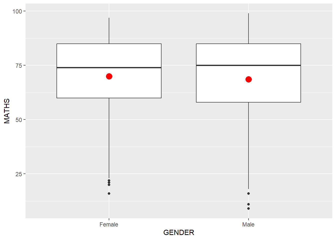
Layman explanation: Line 1: ggplot(data=exam_data, — Starts a ggplot using the exam data; the next line will define the visual mapping. Line 2: aes(y = MATHS, x= GENDER)) + — Maps MATHS to the y-axis and maps GENDER to the x-axis. The plus sign means another layer follows. Line 3: geom_boxplot() + — Summarises each group with a boxplot that shows the median, spread, and possible outliers. The plus sign means another layer follows. Line 4: stat_summary(geom = "point", — Calculates a summary value, here the mean, and draws it as a point on top of the boxplot. Line 5: fun = "mean", — This tells ggplot to calculate the mean as the summary value. Line 6: colour ="red", — This makes the summary point red so it stands out. Line 7: size=4) — This makes the summary point larger so it is easier to notice.
1.8.3 Working with stat - the geom() method
ggplot(data=exam_data,
       aes(y = MATHS, x= GENDER)) +
  geom_boxplot() +
  geom_point(stat="summary",
             fun="mean",
             colour="red",
             size=4)
Layman explanation: Line 1: ggplot(data=exam_data, — Starts a ggplot using the exam data; the next line will define the visual mapping. Line 2: aes(y = MATHS, x= GENDER)) + — Maps MATHS to the y-axis and maps GENDER to the x-axis. The plus sign means another layer follows. Line 3: geom_boxplot() + — Summarises each group with a boxplot that shows the median, spread, and possible outliers. The plus sign means another layer follows. Line 4: geom_point(stat="summary", — Uses a point geom to show a summary value, here the mean, for each group. Line 5: fun="mean", — This tells ggplot to calculate the mean as the summary value. Line 6: colour="red", — This makes the summary point red so it stands out. Line 7: size=4) — This makes the summary point larger so it is easier to notice.
1.8.4 Adding a best fit curve on a scatterplot?
ggplot(data=exam_data,
       aes(x= MATHS, y=ENGLISH)) +
  geom_point() +
  geom_smooth(size=0.5)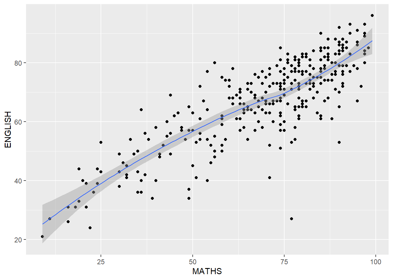
Layman explanation: Line 1: ggplot(data=exam_data, — Starts a ggplot using the exam data; the next line will define the visual mapping. Line 2: aes(x= MATHS, y=ENGLISH)) + — Maps MATHS to the x-axis and maps ENGLISH to the y-axis. The plus sign means another layer follows. Line 3: geom_point() + — Draws each student as a point so we can see the relationship between two numeric variables. The plus sign means another layer follows. Line 4: geom_smooth(size=0.5) — This keeps the line thin.
ggplot(data=exam_data,
       aes(x= MATHS,
           y=ENGLISH)) +
  geom_point() +
  geom_smooth(method=lm,
              linewidth=0.5)
Layman explanation: Line 1: ggplot(data=exam_data, — Starts a ggplot using the exam data; the next line will define the visual mapping. Line 2: aes(x= MATHS, — Maps MATHS to the x-axis. Line 3: y=ENGLISH)) + — Maps ENGLISH to the y-axis. The plus sign means another layer follows. Line 4: geom_point() + — Draws each student as a point so we can see the relationship between two numeric variables. The plus sign means another layer follows. Line 5: geom_smooth(method=lm, — Fits a straight regression line to show the best linear trend in the data. Line 6: linewidth=0.5) — This keeps the regression line thin.
1.9 Essential Grammatical Elements in ggplot2: Facets
Facets split one plot into several small plots so groups are easier to compare.
1.9.1 Working with facet_wrap()
ggplot(data=exam_data,
       aes(x= MATHS)) +
  geom_histogram(bins=20) +
    facet_wrap(~ CLASS)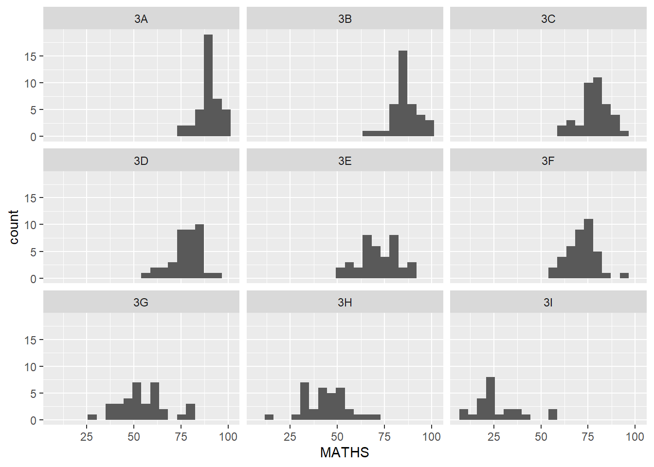
Layman explanation: Line 1: ggplot(data=exam_data, — Starts a ggplot using the exam data; the next line will define the visual mapping. Line 2: aes(x= MATHS)) + — Maps MATHS to the x-axis. The plus sign means another layer follows. Line 3: geom_histogram(bins=20) + — This splits the values into 20 bins so the histogram becomes more detailed. The plus sign means another layer follows. Line 4: facet_wrap(~ CLASS) — Splits the plot into separate small panels, one for each class.
1.9.2 facet_grid() function
ggplot(data=exam_data,
       aes(x= MATHS)) +
  geom_histogram(bins=20) +
    facet_grid(~ CLASS)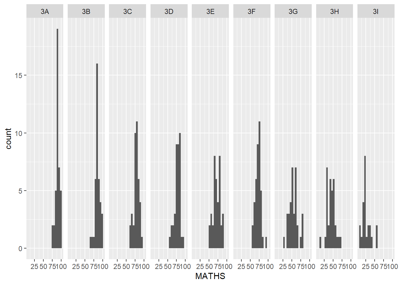
Layman explanation: Line 1: ggplot(data=exam_data, — Starts a ggplot using the exam data; the next line will define the visual mapping. Line 2: aes(x= MATHS)) + — Maps MATHS to the x-axis. The plus sign means another layer follows. Line 3: geom_histogram(bins=20) + — This splits the values into 20 bins so the histogram becomes more detailed. The plus sign means another layer follows. Line 4: facet_grid(~ CLASS) — Splits the plot into a grid of panels, one for each class.
1.10 Essential Grammatical Elements in ggplot2: Coordinates
The chapter mentions coord_cartesian(), coord_flip(), coord_fixed(), and coord_quickmap(); here we use coord_flip() and coord_cartesian() in the examples.
1.10.1 Working with Coordinate
ggplot(data=exam_data,
       aes(x=RACE)) +
  geom_bar()
Layman explanation: Line 1: ggplot(data=exam_data, — Starts a ggplot using the exam data; the next line will define the visual mapping. Line 2: aes(x=RACE)) + — Maps RACE to the x-axis. The plus sign means another layer follows. Line 3: geom_bar() — Counts how many students are in each category and draws one bar per category.
ggplot(data=exam_data,
       aes(x=RACE)) +
  geom_bar() +
  coord_flip()
Layman explanation: Line 1: ggplot(data=exam_data, — Starts a ggplot using the exam data; the next line will define the visual mapping. Line 2: aes(x=RACE)) + — Maps RACE to the x-axis. The plus sign means another layer follows. Line 3: geom_bar() + — Counts how many students are in each category and draws one bar per category. The plus sign means another layer follows. Line 4: coord_flip() — Flips the axes so the plot becomes horizontal instead of vertical.
1.10.2 Changing the y- and x-axis range
ggplot(data=exam_data,
       aes(x= MATHS, y=ENGLISH)) +
  geom_point() +
  geom_smooth(method=lm, size=0.5)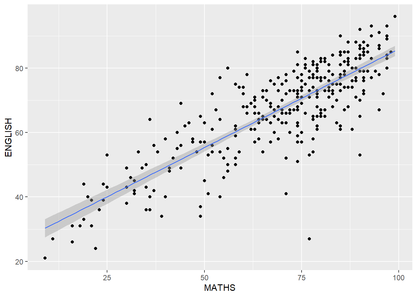
Layman explanation: Line 1: ggplot(data=exam_data, — Starts a ggplot using the exam data; the next line will define the visual mapping. Line 2: aes(x= MATHS, y=ENGLISH)) + — Maps MATHS to the x-axis and maps ENGLISH to the y-axis. The plus sign means another layer follows. Line 3: geom_point() + — Draws each student as a point so we can see the relationship between two numeric variables. The plus sign means another layer follows. Line 4: geom_smooth(method=lm, size=0.5) — This keeps the line thin.
ggplot(data=exam_data,
       aes(x= MATHS, y=ENGLISH)) +
  geom_point() +
  geom_smooth(method=lm,
              size=0.5) +
  coord_cartesian(xlim=c(0,100),
                  ylim=c(0,100))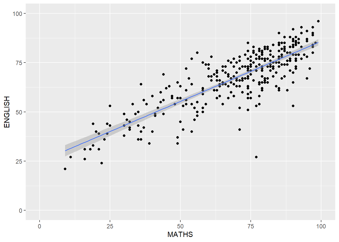
Layman explanation: Line 1: ggplot(data=exam_data, — Starts a ggplot using the exam data; the next line will define the visual mapping. Line 2: aes(x= MATHS, y=ENGLISH)) + — Maps MATHS to the x-axis and maps ENGLISH to the y-axis. The plus sign means another layer follows. Line 3: geom_point() + — Draws each student as a point so we can see the relationship between two numeric variables. The plus sign means another layer follows. Line 4: geom_smooth(method=lm, — Fits a straight regression line to show the best linear trend in the data. Line 5: size=0.5) + — This keeps the line thin. The plus sign means another layer follows. Line 6: coord_cartesian(xlim=c(0,100), — Zooms the view to the chosen x and y ranges without dropping the data. Line 7: ylim=c(0,100)) — This sets the y-axis range from 0 to 100.
1.11 Essential Grammatical Elements in ggplot2: themes
Themes change the look of the chart without changing the data itself.
1.11.1 Working with theme
ggplot(data=exam_data,
       aes(x=RACE)) +
  geom_bar() +
  coord_flip() +
  theme_gray()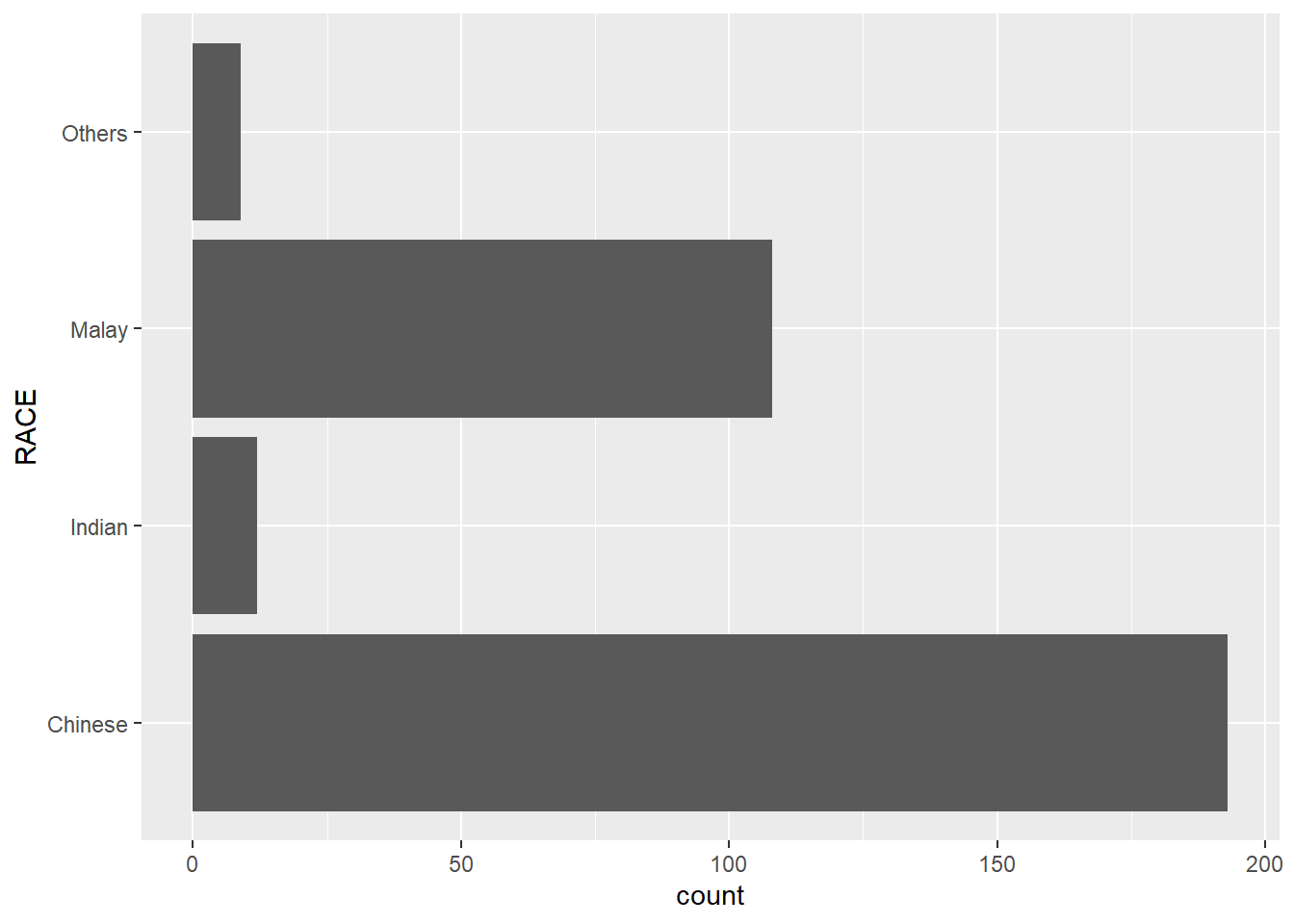
Layman explanation: Line 1: ggplot(data=exam_data, — Starts a ggplot using the exam data; the next line will define the visual mapping. Line 2: aes(x=RACE)) + — Maps RACE to the x-axis. The plus sign means another layer follows. Line 3: geom_bar() + — Counts how many students are in each category and draws one bar per category. The plus sign means another layer follows. Line 4: coord_flip() + — Flips the axes so the plot becomes horizontal instead of vertical. The plus sign means another layer follows. Line 5: theme_gray() — Uses ggplot2’s default gray theme.
ggplot(data=exam_data,
       aes(x=RACE)) +
  geom_bar() +
  coord_flip() +
  theme_classic()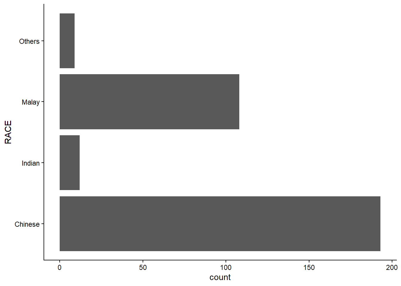
Layman explanation: Line 1: ggplot(data=exam_data, — Starts a ggplot using the exam data; the next line will define the visual mapping. Line 2: aes(x=RACE)) + — Maps RACE to the x-axis. The plus sign means another layer follows. Line 3: geom_bar() + — Counts how many students are in each category and draws one bar per category. The plus sign means another layer follows. Line 4: coord_flip() + — Flips the axes so the plot becomes horizontal instead of vertical. The plus sign means another layer follows. Line 5: theme_classic() — Switches to a clean classic theme with a white background.
ggplot(data=exam_data,
       aes(x=RACE)) +
  geom_bar() +
  coord_flip() +
  theme_minimal()
Layman explanation: Line 1: ggplot(data=exam_data, — Starts a ggplot using the exam data; the next line will define the visual mapping. Line 2: aes(x=RACE)) + — Maps RACE to the x-axis. The plus sign means another layer follows. Line 3: geom_bar() + — Counts how many students are in each category and draws one bar per category. The plus sign means another layer follows. Line 4: coord_flip() + — Flips the axes so the plot becomes horizontal instead of vertical. The plus sign means another layer follows. Line 5: theme_minimal() — Uses a simple minimal theme with fewer visual distractions.
1.12 Reference
See the online chapter for the full reference list.
In simple terms, ggplot2 builds a chart by combining data, aesthetic mappings, geoms, statistics, facets, coordinates, and themes.
Reference: https://r4va.netlify.app/chap01